Value
Value is a description of an area’s relative lightness or darkness. Therefore, it relates to a greyscale more than the color wheel. In a sense, value mostly ignores hue and operates only on the level of how much tint (addition of white), or shade (addition of black), a color may have. Value does not ignore hue completely though because all fully saturated hues will fall on a different natural levels of a value scale (grey scale).
Values help create forms and differentiate space or distance. Gradation of values within a space or shape create forms, or the illusion of volume and mass.
Values can be loosely predicted by looking at the color of the object. Pure yellow will fall near the top of a grey scale, while pure blue-violet will fall near the bottom of the grey scale. All other pure hues fall somewhere in between. Looking at the two images below, the second image is a grey scale conversion of the first. Note how light the value of the yellow circle is compared to the others, also note how little difference there is between values of some of the other colors. This affect is used in B&W to remove any emotional and psychological reaction to color. In return, the viewer responds more directly to the formal constructions of the image and the message.


Today, most photographers are not consciously aware of the colors in their photos. Whatever colors are in front of the camera are of no major concern. There is no attempt at controlling the palette of the image, so unfortunately, value control is also of less concern.The fact is, value can impart as much, or more, emotional response than color. It is the main component of black and white photography. High value or high key images have a light, pure feel to them. By manipulating values through exposure control, a high-key or low-key image can be created. A great example for tone is the work of Edward Steichen.
Edward Steichen (1879-1973) was one of the first commercially successful fashion photographers. He is considered the first modern fashion photographer and worked for large ad agencies. Hired by Condé Nast, he shot for Vanity Fair and Vogue magazines from 1923–1938, the most famous and highest paid photographer in the world during that time. He won an Academy Award for a documentary film in 1945 and became the head of the Photography section of the Museum of Modern Art in New York. Below are examples of his work. Note the use of tones to create drama in the images. His work had a major influence on both the commercial and film industries through WWII.

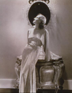
Edward Steichen, “Norma Shearer, 1935”
High valued or high-key images illustrate lightness, airy, open, friendly spaces and aid the impression of confident success. In this image of model Norma Shearer, one can see how the high key tonal use helps elevate the impressions of high culture, wealth and well-being. The placement of her head in front of the mirror subliminally places a halo around her head. This halo becomes a crown when ones vision registers the crystal ornamentation truncated at the top of the mirror. This is an instance where the figure-ground can reverse in the black shape within the mirror. It seems to stand forward of her head at times.

Edward Steichen, “J P Morgan, 1903”
Dark value or low-key images usually have a heavy or oppressive feel to them. Steichen has used low key lighting and dark tones in presenting us with a menacing image of financier J P Morgan, one of the most feared and hated men of his day. Note how the arm rest on the right side of the image takes on the appearance of a knife.This was not entirely unintentional and shows one approach to strengthening the message of an image.

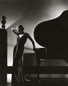
Edward Steichen, “Margaret Horan, 1935” for Vogue
Using heavy darks in concert with vibrant whites adds drama.This image of Margaret Horan, shot for Vogue Magazine, is a study in shapes, lines, forms, space and tones. Steichen could easily have used an overall darker palette but would have lost the drama and elegance of the image. A high-key treatment would have become too much of an abstraction dismissing the pose and human element. Consider also how the image would change just by shifting the camera 1 foot to the left. The near tangent of her upper thigh would have disappeared into the rectangular shadow on the rear wall. The elegant line created by her left side would no longer show, resulting in a less glamorous image.
If you are observant you will also catch the implied line traveling from the statuette down both arms to the piano. Only to be turned back by the right triangle in the white space created by the curved shape of the piano top and her arm.
Texture
Texture is created by contrast changes along the surface of an object. It is a byproduct of the angle of the light and the roughness of the surface of an object. The illusion of texture in a photograph is created by small, localized changes in contrast. If a surface is rough, there will irregularities on the surface. As long as the light illuminates the object from aside or rear angle, it will create a shadow and highlight on the irregularities. This creates changes in value or color, higher in the highlight side and lower in the shadow side. These differences in local value, contrast, are what we perceive as texture on the object.
A smooth surface has no irregularities so it exhibits little localized contrast and so appears to have no texture.
Texture gives an object a sense of being real and tactile. Presented correctly, texture becomes a quality we can “feel” without actually touching. The brain sends a feeling to receptors in the fingers and we experience a “sense” of the texture. Coarse textures exhibiting high localized contrast will have a rough or severe character. Smooth textures exhibiting lower localized contrast will have a calm or sensuous character.
These images by Edward Weston (arguably the most influential photographer of the 20th Century) exhibit entirely different textures. The first image, titled, “Church Door, Hornitos, 1940 is a good illustration of how localized changes in the surface create the feeling of rough texture. Notice that the light is coming in from a high, side angle. Without the right lighting, texture becomes nothing more than the tonal changes we see in the shadow area of the door.

Edward Weston, Church Door, Hornitos, 1940
The second image, titled, “Nautilus, 1927” illustrates how a lack of texture enhances the illusion of an objects smooth surface on the two-dimensional print. Using rather flat lighting enhances the affect by filling in any local texture. This reduces contrast changes even more.

Edward Weston. Nautilus, 1927
The same applies to Weston’s, “Pepper No. 30, 1930”.

Edward Weston. Pepper No. 30, 1930.
Unrelated to texture, notice how the figure-ground relationship of the upper portion of the shell itself can change, resulting in an ambiguous form. At any one moment, the upper hollow of the shell seems to take a shape, projecting forward, toward the viewer. At another moment it reverts to a literal reading of the shape and recedes behind the base of the shell. Both of these photographs are illustrative of photography’s ability to transform an objects image from a record of an object to a sensual, organic form created in the viewer’s mind. The shell might remind one of a toadstool or a phallus The pepper imitates a human form rendered into a twisted shape and is mirrored in Weston’s most famous nude of Charis Wilson.
You must be logged in to post a comment.