Color – III – Contrasts Part 1
This last color topic will be about color contrasts. The research of Johannes Itten defined methods for devising color combinations. According to Itten, who taught at the Bauhaus, and penned authoritative books on the subject, they color contrasts are:
1. Contrast of Hue
2. Light-Dark Contrast, or contrast of Value
3. Cool-Warm Contrast
4. Complementary Contrast
5. Simultaneous Contrast
6. Contrast of Saturation
7. Contrast of Extension or Contrast of Proportion
One of the first things to understand is that in any single example, more than one contrast type can be identified. For example, if you are looking to create a complimentary contrast, you will probably end up with a warm/cool contrast in the same sample. Below is an illustration of that idea. Where the yellows and the blue-violets are compliments, they also exhibit a warm/cool relationship.

Warm/Cool Contrast
A more complex example is the one below. The colors are complimentary and exhibit a warm/cool contrast. They are examples of simultaneous contrast (irradiation of edges). They exhibit low value contrast (there is little difference in the values between the colors), and low saturation contrast (there is little difference in the saturation of the colors). Last, there is a contrast of extension in each sample (the proportion of each color balances).

Image displaying multiple contrasts
Note: The examples in the discussions below may exhibit more than one contrast type; simply concentrate on the one discussed.
Contrast of Hue
Contrast of hue is what you get when you choose to use any of the color harmonies talked about in the last chapter. Using a simple color triad (triangle) or double split compliment (square or rectangle) harmony straight from the color wheel illustrates the point, though any harmony will work.


Contrasts of hue come in degrees from high contrast to low contrast.
The highest hue contrasts are those created using compliments, split compliments, and triangular color harmonies, of full intensity colors. The example below is a triad made up of Red, Green and Blue illustrating a high contrast of hue.

Hue Contrast
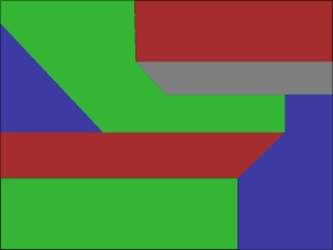
Same hue, lower amount of contrast. The affect was created by desaturating the colors.
A lower contrast of hue can be created by desaturation of the same colors (above) or by use of an analogous color harmony like the examle below. Note that the image below, even though it is quite bright, exhibits an overall lower contrast difference between the colors.

Lower hue contrast through use of analogous colors.
Fully saturated hues have a greater effect on adjacent colors than less saturated hues, and will appear to have greater contrast difference. In both images below, the example on the left appears to be of higher contrast than the one on the right. Notice also that the left sample of each image seems livelier, while the right may feel more sedate or calming, due to desaturation of the hues.

High Hue Contrast
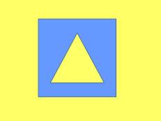
Low Hue Contrast

High Hue Contrast – Analogous Colors
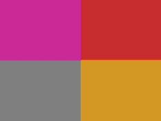
Low Hue Contrast – Analogous Colors
Contrast of Value
Remember that value is the relative lightness or darkness of the color used, relative to how it would appear on a grey scale. Value contrasts are those that depend on tinting and shading of the colors. Take a pastel color scheme for example. Its attraction is its lack of color intensity. All of the background colors have had been tinted by adding white added to the hue. Looking at the trio of samples below, note how the four center squares in each example vary only by value. Each grouping has its own effect, and each has its own usage in design.

Sample of value change in center square groups.
If you are paying attention to what your eyes are seeing here, you are going to notice that the background colors do not seem to be the same. The sample on the left appears to have lighter background squares than the middle and the right samples. If you have the time, copy the images and measure them in your photo-editing program. You will find each of the three samples is in fact using the exact same background. What you are observing is “color effect” or the influence one color can exert on another.
Light colors on a light background will always appear darker than the same light color on a darker background. Conversely, darker colors appear lighter on a dark background than the same color on a lighter background.
This is illustrated in the sample below, the center group is the same as the center group above. The differences in this case are that the center four squares of each group are the same in each, only the background value changes. You can see that the center squares in the first group appear darker than those in the last group.

Effect of changing background value
Here is another example. These samples are entirely different, but the effect is the same. They illustrate how a dark color will appear lighter on a dark valued background, and a lighter color will appear darker on a lighter valued background.


Posterization uses value contrast as a tool for defining form in an image. By separating an image by the values existing in the image, each band of values can be assigned a color. This could create an interesting rendition of an otherwise boring image.
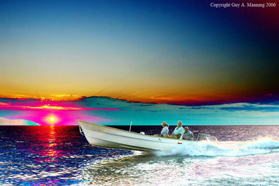
Sample of a boring image enhanced through posterization
Warm/Cool Contrast
This contrast is based simply on contrasts created when using warm or cool colors. See the Color II chapter for a full explanation. From a psychological standpoint, warm and cool colors become associated with experience. That is, warm colors are associated with excitement, energy and heat. The cool colors are associated with rest, calmness and cold temperatures. Physiologically, when comparing warm and cool colors of the same value or intensity, the warm colors will appear lighter or brighter than their cool neighbor will. They will also seem to stand forward of the cool colors, while the cool seems to recede back into the frame a bit.
This phenomena of standing forward and receding is easiest seen when overlaying a pure red on pure blue, and overlaying pure blue on pure red. It is easy to see how the blue seems to reside behind the red on both halves of the image below. This is not a purely optical trick. Red and blue exist at different wavelengths. If attempting to focus a camera on a red and a blue object, the same distance from the lens, they will require a slightly different point of focus to maintain maximum sharpness. This is not readily apparent in most cameras due to the small viewing surface. If you ever get the chance to use an 8X10 view camera, this will be readily apparent when focusing the objects on the ground glass.
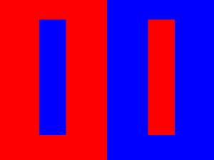
This warm/cool contrast example illustrates the spatial effect of colors, where they may appear to exist on different planes. Here the red seems to stand forward of the blue.
This spatial effect, the color advancing or receding, is associated with our perception of colors, and how we relate them to atmospheric perspective. Warm is usually seen as existing forward of the cool on an image plane. The work of Piet Mondrian is an excellent example of the effect.
In the image below, “Color Composition”, the reds seem to exist forward of both the blue and the yellow. I cannot determine if this is shown with the correct edge up. It appears different ways on different sites.

Color Composition, Piet Mondrian.
The spatial effect can be overridden by adjusting the intensity contrasts of the image. These next two images show such an example. In the first image both colored blocks are of full intensity, or saturation. The cool color recedes and the warm comes forward.

Spatial effect – blue recedes, yellow comes forward
The spatial effect is reversed here, simply by changing the tonality of the yellow.
In the second image, the saturation of the yellow is reduced. If you look carefully, you will see that the cool color now seems to come forward and the warm color recedes.
This also shows up in another of Piet Mondrians Paintings. In “Composition Chequerboard Dark Colours”, 1919, Mondrian purposely reverses the effect, the cool colors come forward of the red. Keep in mind that many of Mondrians works were experimentations of the use of color based upon the recent scientific investigations of perception and color theory that had taken place in the preceding decades. So much of his work was playing with these new ideas to see where he could take the concepts. This is one of the traits of a true Artist, manipulating ideas and creating new ways of perceiving the world.

Mondrians, “Composition Chequerboard Dark Colours”, 1919. This illustrates how the warm/cool spatial effect can be reversed.
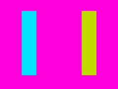
Looking at another example, one can see how the hues used can also affect the spatial effect. In the image shown below the yellow is obviously forward of the background while the full intensity cyan also moves forward of the full intensity cool yellow-green. This is a borderline example and my not be perceived by everyone without effort.

Spatial effect where both the warm and the cool colors stand forward of the background.
Complimentary Contrast
You know what complimentary colors are; they are colors that exist on opposite sides of the color wheel. This point was covered in the last chapter, Color II. As mentioned before, unless the colors are the borderline hues of magenta and green the compliments will also exhibit a warm/cool contrast.
The illustration below shows samples of complimentary colors.

Complimentary Colors
Mixing complimentary colors will cause the result to tend toward a neutral grey. If you are mixing paints dyes or pigments, this will not work (see the chapter, Color I). Below are 2 photo-editor examples of color blends made using the vertical compliments residing on the horizontal and vertical axis on our color wheel. Notice how they both mix to grey in the middle. Feel free to copy these samples and use the color picker in your editing program. You will find a place in the middle of each blend where the red, green and blue channels all how a reading of 128 at the same time. That is as neutral a grey as one can find.

Blend of the magenta and green compliments, showing how they mix to a neutral grey.

Blend of the red and cyan compliments, showing how they mix to a neutral grey.
Mixing non-complimentary colors creates an intermediate of the two mixed hues. Here we see a red to yellow mix.

This red yellow blend shows how the mix will not tend toward a grey, but the intermediate orange color.
Many painters through history have used complimentary color schemes. Vincent Van Gogh used complimentary colors, usually in split compliments, in quite of few of his works. Below is his “Prisoners Exercising, After Doré’, 1890. This warm orange, cool cyan-blue color scheme is a perfect example of the use of compliments. Next to it is a reproduction of the original engraving by Gustave Doré. Keep in mind there is no reason to believe the colors are accurate in the reproductions.
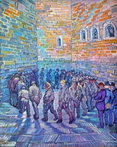
Prisoners Exercising, After Doré’, 1890

Newgate Exercise Yard, Gustave Doré
Image Source: Van Gogh
Image Source: Doré
Next Time: Color III – Contrast Part 2
Lens, Light and Composition is presented in a structured form with occasional asides. It is not a semi-random presentation of information. To get the greatest benefit from this blog it is advised that you start at the beginning of the table of contents, and work your way down from there. Thanks for reading.
You must be logged in to post a comment.