Heirarchy & Harmonies
It is true that most amateur and many professional photographers will never have occasion to relate to, or arrange the colors in their images. Where much of the following information will come in handy is when seeking out abstracts or a scene where the colors become the composition, and content is secondary. It will also be important for a studio photographer planning scenes and tabletop setups.
This is not to dismiss the topic of color. It is still part of a well-rounded compositional background and should be understood at a basic level. Knowing when and how to adjust your colors will always prove to be a useful tool. Consider the color temperature tool, it works on the basis of a rectangular, double split compliment (see below). The Temperature control changes the Yellow-Blue balance (black arrows), while the Tint control changes the Magenta-Green balance (white arrows).
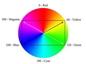
Rectangular Dual Split Compliments. This Yellow-Blue and Magenta/Green color scheme is used by color temperature correction tools in photo editing programs.
Ultimately color harmonies are easy to understand and visualize because the patterns the relationships make on the color wheel are composed of basic geometric shapes.
Heirarchy
Colors have a hierarchy – Primary, secondary and tertiary.
The most basic colors, and the foundation of the RGB (Red, Green, Blue) color model are the primary colors of red, green and blue of course. The secondary colors are cyan, magenta and, yellow. Secondary colors are those resulting from mixing equivalent amounts of any two primary colors as seen below where the primary colors overlap.
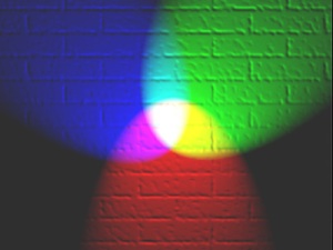
Red, Green, and Blue primary colored lights projected on a white wall. Where they overlap with another color, they create a secondary hue of Cyan, Magenta, or Yellow. Where all 3 overlap they create white light.
The tertiary colors are the results of mixing equivalent amounts of any primary and an adjacent secondary color. Tertiary colors are called by a hyphenated designation composed of their primary-secondary mix. For instance: yellow-green, magenta-blue, or cyan-blue. The only exception is the red-yellow combination named after a popular citrus fruit – orange. The other combinations do not have names that everyone would associate with a given hue. For instance, when we say purple, some people imagine a blue-violet while others imagine a lavender color. Other names like fuchsia or chartreuse are too vague for accurate use. Orange is the only tertiary color providing a common experience
.
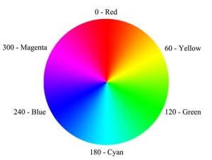
RGB Color Wheel with co-ordinates.
In the illustration above, the primary colors reside 120 degrees apart, beginning at zero. The secondary colors reside 120 degrees apart, beginning at 60. Tertiary colors reside 30 degrees to either side of any primary or secondary color.
Harmonics
There are seven basic color harmonies.
- Monochrome
- Warm – Cool
- Diads
- Analogous
- Compliments
- Triads
- Split Compliments
- Tetrads – Quadratic – Square or Rectangular – Double Split Compliments (all meaning the same thing)
Relationships between harmonic colors, like the complimentary a relationship, can be difficult to envision using the software color pickers. The best cure for this is to relate to an accurate color wheel like the one we will be using in this discussion. Above we have indicated the primary and secondary colors with their corresponding co-ordinate numbers from an RGB color picker.
Under most circumstances, harmonies are relative to a chosen target color. For instance, you may want to find out which colors harmonize with green. So green becomes the target color. Whichever color you choose as a target, you apply harmonic schemes to, in order to find out which harmonies fit the need.
Monochrome colors schemes are those where one hue is used in differing shades, tints or tones. The simplest example of a monochrome image is any black and white photograph. This detail of interior window of the then abandoned Uniroyal Tire Building, near Los Angeles, CA. This image is a good example of the use of line, shape, tone, form and similarity.
Another example of a monochromatic image would be a sepia toned image or Cyanotype like the one below. Cyanotypes are one of the first alternative processes one would usually learn in advanced photography classes. Watercolor paper is coated with a solution mixture of potassium ferricyanide and ferric ammonium citrate. The paper becomes light sensitive and is allowed to dry in the dark. An image is produced by exposing a film negative to the paper under a strong light, or by placing items on the paper in a strong light. Once the exposure is made the paper is “developed” in a water bath. The resulting image is a monochromatic cyan-blue. like the example below made by Anna Atkins as part of a study of algae in the late 19th Century.
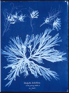
A photogram of Algae, made by Anna Atkins as part of her 1843 book, “Photographs of British Algae: Cyanotype Impressions”, the first book composed entirely of photographic images.
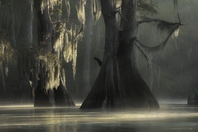
Another example of monochromatic color use is this color image by Louisiana photographer, David Chauvin entitled, “Cypress in Mist II, Lake Fausse Point”. Though not strictly composed of tonal variations of one color, it is close enough to consider it monochromatic. Aside from the color, I love the way the shapes compose within the frame. The gestalt similarities working between the two grouping pair of Cypress tree’s, help draw the eye’s interest and unify the forms.
Contrasting to these dark hulking forms, the brighter sunlit portions of the mist and water surface move across the bottom of the frame. These shallow diagonals add just the right amount of motion and tension to a space that would have become boring had the lights appeared in flat horizontal strips. In turn, the vertically hanging moss counters the shafts of light, which rhyme the same tonal and color range as the sun lit mist and water. These harmonies mask, but do not totally obliterate the details hidden in the background allowing the background details tell secrets of their own. Spatially the scene feels like part of a stage setting for a ballet. The background appears as the same flat plane one would see in an backstage screen. The dead still water surface appears as a dance floor, and I almost expect the “Wilis” from the ballet Giselle float across the space. The overall effect allows the viewer’s vision to wander the stage, but not too far from the major players. They still impose their presence through an aloof , monumental presence .
Warm – Cool colors are colors that the mind associates with temperature. Reds and yellows are warm hues, while blues and purples the cool hues. The border colors, greens and magentas, may be perceived as either warm or cool depending on how far off their center point the hue is, and the perception of the viewer.
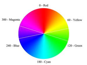
Warm and cool color boundaries run approximately across the middle of a color wheel. The lines here, approximate the indistinct horizontal boundaries.
As a general guideline you could draw a line horizontally through the center of the color wheel above to divide the warm colors (top half of circle) from the cool colors (bottom half of circle).
Dyad color harmonies use only two colors located in close but non-adjacent proximity on the color wheel. Dyads would skip one intermediate hue. They may both be tertiary colors, or one primary and one secondary color. To determine Dyad colors one could look at an analogous layout and remove the central color. The examples below show target colors of a dyad. The color samples match the first and third color wheels choices.

Dyad Selection on color wheels

Dyad Color Harmony from first wheel

Dyad Color Harmony from third wheel
It should be noted that there seems to be a confusion over the term Dyad. Some consider a dyad to be a color harmony made up of 2 colors existing opposite each other on the color wheel. This describes complimentary colors, so I am using dyad in the sense of non-contiguous analogous colors. This is also how I remember it from what I learned at Art Center, so I am sticking with the term.
Analogous colors, or an analogous color schemes, are colors that exist in close proximity to the target color on the color wheel. Analogous describes any color within about 30 degrees of the target color. Another way to think of it is the next primary, secondary or tertiary color that sits adjacent to the target color on the wheel. Analogous color schemes are the least complicated for just that reason. You do not have to go far from the target color to find them. About the only drawback in using analogous color schemes is that they tend to be boring. However, that may be used to advantage in the right circumstances, for instance a calming light blue color scheme in a nursery.
Below shows an RGB color wheel indicating analogous color schemes. In essence, any colors falling within the V shape would be analogous to the target color in the center of the V.

Analogous Color Harmonies on color wheels
These next two illustrations are the analogous combinations indicated in the first and second color wheels above. The first shows analogous colors from the red-magenta, through red, and into the yellow-orange range. The second example show a cool set of purple, blue and cyan. In both sets the colors exist adjacent to one another on the color wheel.
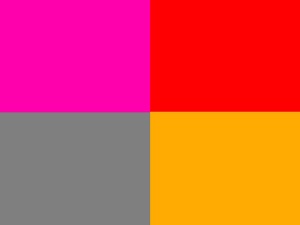
Analogous Color Harmony based upon first wheel

Analogous Color Harmony based upon second wheel
Since we are dealing with uneven numbers of colors, I have included a medium grey in the left over quadrant. Medium grey will compliment any color or color combination This is because grey is a mixture of all three primary colors equally. In this manner, the examples will not be influenced in an adverse way by an outside color.
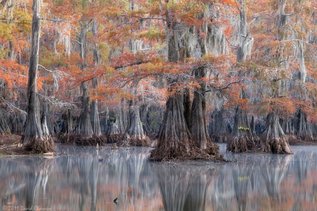
Another of David Chauvin’s images serves to illustrate how grey can serve as a compliment to any color.
Here we see a color palette made up of muted orange, yellow-green and grey. By themselves the orange and yellow-green analogous combination would lack interest and contain a slight overall warm feeling. With the inclusion of the greys, this feeling changes. The greys create a perfect compliment for offsetting the analogous palette, and move the whole toward a much cooler feel. A balance within the color palette is now obtained melding with the positioning of elements in the frame. A harmony is achieved that could not exist otherwise.
Complimentary colors are colors that exist opposite each other on an accurate color wheel. Complimentary color harmonies are the second least complicated of color schemes. Think of them as the Yin-Yang, the opposing forces, the contradictory colors. Complimentary combinations will always have one warm color and one cool color unless they both fall within the indistinct boundaries between warm and cool.

Complimentary Color Pairs will always exist on opposite sides of the color wheel.
Below are two illustrations using complimentary combinations taken from the second and third color wheels above. Notice that the first shows colors that ride on point where they are difficult to call cool or warm. You may feel the lavender color is cool while someone else feels it is warm. You are both correct because everyone perceives color a little differently.
Now look at the second set. Here the lavender has moved more toward a cool purple-blue and the green is moving toward a warmer yellow-green. From this, it should be evident that when one shifts warm or cools the other shifts in the opposite direction.

Complimentary pair, indistinctly warm or cool.

The colors in this complimentary pair are not so indistinct in their warm/cool relationship.
For those using pigments or paints, mixing complimentary colors can be useful for producing neutrals or toned down hues. This does not work when mixing colors on a computer. We are still hindered by the RGB palette and must suffer that restriction. For example, try to make a brown by combining green and red. You can do it with paints but not with a computer. Find the browns in the tones and shades of the orange area of a picker color picker.
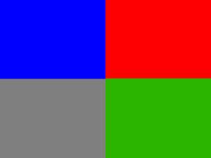
Triad color schemes are composed of 3 colors equally spaced around the color wheel. These schemes will contain colors that are all primary colors, or all secondary colors, or all tertiary colors, due to the equal spacing between them. Notice how the indicators make up an equilateral triangle on the illustration below. The color samples are taken from the first and third wheels. Again, the grey panels are to balance the rectangle without interfering with the rendering of the colors.

Triad Color Harmonies, the first is all primary colors, the second is all secondary colors, the third is all tertiary colors.
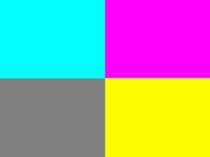
- A triad of secondary colors
Split compliment color harmonies are when, instead of using the color directly opposite the target color, those analogous to the opposite color are used. For instance, in the first example below, the target color is red. The compliment for Red would be Cyan. However, the split compliments fall to either side of the compliment. This leaves the split compliments being a blue-cyan and a green-cyan. Think of the word split meaning there is a gap between two color elements.
Looking at the illustrations below you will notice that in split compliment harmonies, the splits will always be tertiary colors regardless whether the target is a primary or secondary color. If the target is a tertiary color, the splits will be one primary and one secondary color. The color samples come from the second and third wheels.
Split compliment color harmonies seem softer, less bold, than the triads.

Split Compliment Color Harmonies
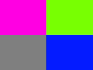
Split Compliment Color Harmony
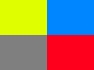
Split Compliment Color Harmony
Double split compliment harmonies may also be referred to as tetradic or quadratic harmonies, or by square and rectangular harmonies. They all mean the same thing. There are four color components made of two sets of complimentary colors. All double split compliments involve use of four hues.
It is probably easiest to refer to split compliments using the terms “square” or “rectangular” compliments. Latin based names are not easily processed by English speakers.
Square double split compliments consist of any four colors that exist 90 degrees apart on the color wheel, forming a square when connected. Some think of them as two pair of complimentary colors perpendicular to each other. The first color sample is based upon the first wheel, the second is based upon the second wheel.

Double Split Compliment Harmony – Square
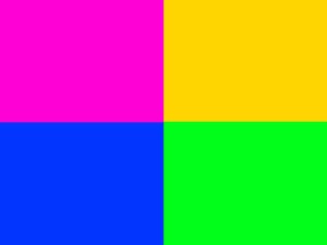
Double Split Compliment Harmony – Square
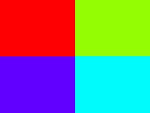
Double Split Compliment Harmony – Square
Rectangular double split harmonies consist of two pairs of compliments skipping one color between each pair. Think of them as complimentary dyads. A rectangle is formed when connecting the colors on the wheel. The color samples are from the second and third wheels respectively.
Note that the rectangular compliment combinations seem to be softer than the square compliment combinations.

Double Split Compliment Harmonies – Rectangular
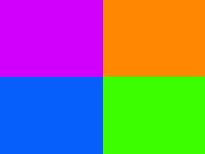
Double Split Compliment Harmony – Rectangular
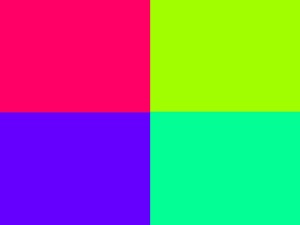
Double Split Compliment Harmony – Rectangular
You have probably already noticed the harmonies are all relative to geometric shapes, lines, triangles, squares, rectangles. This makes it easier to visualize them when needed.
Next Time: Elements of Design – Color – Contrasts
Lens, Light and Composition is presented in a structured form with occasional asides. It is not a semi-random presentation of information. To get the greatest benefit from this blog it is advised that you start at the beginning of the table of contents, and work your way down from there. Thanks for reading.

You must be logged in to post a comment.